Five Minutes with Carl Cullinane on the Democratic Dashboard: “There’s a big difference between open data and accessible data.”
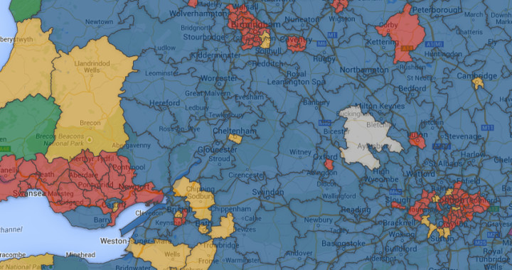
Sierra Williams caught up with Carl Cullinane, the project lead behind the Democratic Dashboard, a voter information resource making constituency data open and accessible in the run-up to the UK’s General Election. Because of the variety of data sources used, it was a huge job to harmonise the structure and formatting of the datasets to make them compatible. The Democratic Dashboard is fundamentally citizen-focused, but aims to provide enough depth and complexity to keep researchers and ‘election junkies’ interested.
 What is the key aim of the Democratic Dashboard?
The primary aim of the Dashboard is to inform voters (and potential voters) about their local context in the run up to the election. People in general, and younger generations in particular, have become much more geographically mobile. If you have moved house in the last five years you may not even know what constituency you live in. The Dashboard seeks to fill that information gap through the digital world.
This time around, this information is more important than ever. With the fragmentation of the party system, combined with the First Past the Post electoral system, this election will be less of a national election, and more a complex series of local battles. If a voter wishes to maximise their effect on both the national and local picture, the more information they have on the choices available to them the better.
Where does the data come from and what methods were used to compile the database?
The data comes from a variety of sources, from the House of Commons Library, to the Electoral Commission, to several repositories of electoral information compiled by individuals. One of the motivating factors behind the site is to bring this wealth of information together into one, citizen-focused location.
Because of the variety of data sources used, it was a huge job to harmonise the structure and formatting of the datasets to make them compatible. Even on a simple level, I must have come across between 5 and 10 different sets of constituency name formats used by different sources, all very similar, but not fully matching. Datasets were cleaned and cross-checked with other sources, where possible. When you’re dealing with over a hundred datasets and thousands of variables it’s impossible to root out all errors. But there’s nothing like making data public to eventually weed out any mistakes…
Is the data open and how do you see people and researchers using this data beyond just the Dashboard?
We have published interactive data tables on the site, and will soon publish the full dataset in the LSE library online. Open data is a concept at the heart of the project. While almost all of the data used in the Dashboard is openly available elsewhere, in reality much of it can only really be accessed by researchers with the skills and time to find, process and interpret it. There’s a big difference between open data and accessible data. The UK has made great strides in making data open, but it is spread so diffusely across multiple websites, with many different methods of formatting and storage, that it’s really not very user friendly. The Dashboard is not a panacea to this obviously, but within a narrow subject area we hope that our data will be both open and accessible to all types of people.
You’ve done some very accessible and informative graphs – how difficult and time-consuming is it to come up with engaging visuals to share the data?
The site was always going to live and die on the quality of the data visualisation, and I’ve spent a long time considering the best way to present each type of data we want to show people. There’s a lot of trial and error, and there are also a lot of technical constraints. Even when you settle on the best type of chart or graph, it’s not always technically possible to present it in the way you would like, particularly given the resource constraints of this project.
The other challenge is appealing to a broad range of users. We want the site to be appealing and engaging to people with only a casual interest in politics who are looking for information, but we also hope to provide enough depth and complexity to keep researchers and ‘election junkies’ interested. Achieving that balance is not easy. Hopefully we’re getting there.
What advice do you have for researchers looking to convert complex datasets into informative and useful platforms?
I think ultimately you have to focus on the end user. Who is going to be looking at the platform and what are they going to want to get from it. It sounds like an easy thing to do, but it’s often more difficult than it sounds. When you work with complex data a lot you become very immersed in it and it’s easy to get lost in the intricacies. It can be a real job to take a step back from that. It’s very much about knowing your audience. The type of data visualisation academics enjoy and are accustomed to is just different to that of the general public. Election data is possibly an easier area to tackle than most, because data visualisation is something that’s always been at the heart of election coverage. Voters are very much used to bar charts and pie charts and ‘swingometers’ in the newspapers and on TV.
One silly example of how easy it is to lose perspective when working with data: in official ONS statistics, the label for region almost always includes Wales, Scotland and Northern Ireland alongside the English regions. After working with these datasets for months I started to subconsciously regard Scotland or Wales as just another unit alongside the North East, or the West Midlands. However, once the site went public I was very quickly reminded on social media that the political reality, outside of neat datasets, is very different.
—
Note: This article gives the views of the author, and not the position of the Democratic Audit UK blog, nor of the London School of Economics. It originally appeared on the LSE Impact of Social Science blog. Please review our comments policy before posting.
—
 Carl Cullinane is Research Assistant at the Democratic Audit, and is responsible for conducting in-house research along with contributing to the blog and other DA outputs. He holds a degree in Philosophy and Political Science from Trinity College Dublin in 2005, along with MSc’s in Philosophy and Public Policy from the LSE and Applied Social Research, also from Trinity College.
He has worked for the Irish Ombudsman for Children, the Economic and Social Research Institute in Dublin, and the Carnegie Council for Ethics in International Affairs in New York. From 2012-2014 he was a statistician with NatCen Social Research, working on a range of national household surveys and secondary analysis projects. He joined the Democratic Audit in Summer 2014, and can be found on twitter at @cullinanecarl


 Democratic Audit's core funding is provided by the Joseph Rowntree Charitable Trust. Additional funding is provided by the London School of Economics.
[…] to an interview by Sierra Williams on Democratic Audit UK, the primary aim of the Dashboard is to inform voters (and potential voters) about their local […]
The type of data visualisation academics enjoy & are accustomed to is just different to that of the general public re https://t.co/aTlqrUghPH
“There’s a big difference between open data and accessible data.” – Carl Cullinane.
https://t.co/oJClcFlEBj
#opendata, #DataRevolution
The Democratic Dashboard. There’s a big difference between #OpenData and accessible data – https://t.co/OSs74Uy0Ds
There’s a big difference between open data and accessible data https://t.co/1NShMXVs2A #opendata
5 Mins w Carl Cullinane on Democratic Dashboard: “There’s a big difference between #opendata and accessible data.” https://t.co/07728uODLh
5 Mins with Carl Cullinane on Democratic Dashboard: “There’s a big difference between open data & accessible data.” https://t.co/JnesfClME9
Five Minutes with Carl Cullinane on the Democratic Dashboard: “There’s a big difference between .. – https://t.co/xqpAQebrVL #GoogleAlerts
“There’s a big difference between open data and accessible data.” https://t.co/i8rNumiAi3 #agree
The Democratic Dashboard: There’s a big difference between #opendata & accessible data | https://t.co/2NDPosUUl1 #BigData #UKGeneralElection
Five Minutes with Carl Cullinane on the Democratic Dashboard: “There’s a big difference between open data and acce… https://t.co/3CAYF5qJ8P
Carl Cullinane on our Democratic Dashboard: “There’s a big difference between open data and accessible data.” https://t.co/Yj5VuziWb9
Carl Cullinane on Democratic Dashboard: “There’s a big difference between open data and accessible data.” #opengov https://t.co/tuhxYs708M
@damicod https://t.co/UZ7adJYtnO credo ti interessi
Five Minutes with Carl Cullinane on the Democratic Dashboard: “There’s a big difference between open data and… https://t.co/XQxD00kgqj